Overview
Visualization plug-ins shows data sets and usability test context model in one or more interactive views. Design of the visualizations for the IVE tool reflects principles of information visualization stated by Shneiderman and Spence. These principles are:
- Make overview about all data.
- Descend into details of individual data.
Therefore the developed visualizations allows zooming and scrolling of the view and they provide informations about individual data set records, which are active in particular visualization, e.g. as a tooltip when using mouse. Currently, several 1D, 2D and 3D visualizations were developed but other visualizations are possible to implement. These visualizations are focused on usage of the tested application as well as on user behavior. Usability test context model is used in particular visualizations to filter data, segment data or to provide information related to particular data set record that is part of the connected submodel. Besides association between data sets and usability test context model, but also time coherence between data sets is used to enhance visualizations.
Each visualization plug-in is instantiated using IVE wizard that allows selection of the visualization plug-in and selection of data sets or submodel of usability test context model that will be used in the visualization plug-in views. Each visualization plug-in can also announce which data sets are mandatory and it can also limit the amount of data sets. Visualizations plug-ins may announce changes to other visualization plug-ins, e.g. highlighting of the same information in other visualization plug-in views. Instead of storing this information in the internal database we used a central message dispatcher that collects and resends all messages between all visualization plug-ins.
Audio/video player
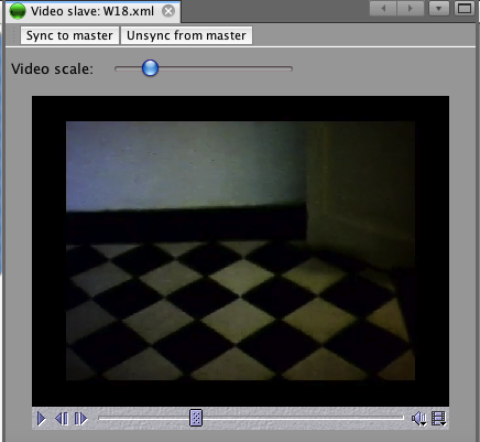
Audio/video viewer plugin (also referenced as video viewer) was implemented for synchronous replay of audio/video data. Audio/video recordings take advantage of time coherence with remaining data sources. Video time value is sent to all visualization plug-ins through message dispatch manager in order to show current time synchronized with audio/video recording.
Timeline
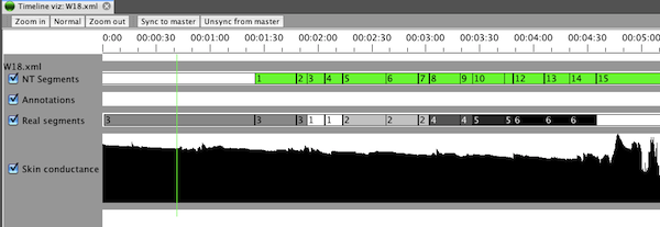
The timeline is commonly used for 1D interactive visualization provided to the usability practitioner by tools working with video recordings. In its basic format, timelines present a sequence of log records. These entries may represent sequence of user interface events like keystrokes or mouse clicks or observer notes. Each type of log is visualized in dedicated timeline.
The example of timeline visualization view is in figure bellow. The length of the timeline corresponds to the duration of the test and the length of small rectangles corresponds to the duration of particular record in the log. For further orientation in the visualization view the timescale is provided at the top of the view.
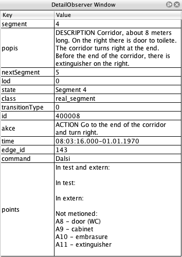
Parameters of the data set record can be mapped to the color or text label of the rectangle. This way it can be differentiated between e.g. mouse clicks and keystrokes. It is up to the observer how he/she maps the values of the data set record to the color of the rectangle. Another geometric shapes can be also used to visualize different types of data sets. When data set record contains additional information, such information can be displayed by dedicated detail window or as a tooltip, which appears after moving the mouse over the log entry.
Application state log visualization
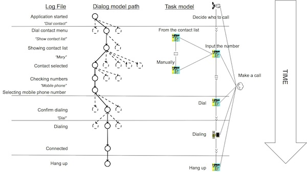
Application state log visualization combines data from application state log and UI event log with dialog model and task model. This visualization shows the data sets and models as combination of 1D timeline visualization and graph based visualization of models.
An example of the application log visualization is in the figure bellow. The application state log records are presented as a states in the diagram (solid line circles). The states are connected by black solid line arrows that represent sequential character of the application state log records. The time goes from top down. Because of the connection with the dialog model, alternative states (dashed line circles) can be added into the visualization. Alternative states are those dialog model states, which can be reached from each particular state. These alternative states are connected with the log record states with dashed line arrows and are aligned horizontally. To preserve simplicity of the diagram any other states of the dialog model are not visualized. UI Event log records are associated with each state and they provide description of action, that was performed by the test participant and that caused movement between tasks in dialog model.
When the application state log contains a large number of records, it is necessary to do some filtering and clustering. Therefore the task model is incorporated into the visualization. In the figure bellow, the CTT task model notation is used, but HTA diagrams can be used as well. Task model diagrams are visualized originally rotated 90 degrees counterclockwise compared to the visualization. Therefore the top task is the rightmost (originally upmost) rectangle and atomic tasks are the leftmost (originally downmost). Visualizations of application state log connected with dialog model diagram and task model visualization are synchronized. All states which are part of individual atomic task model tasks are grouped and separated by horizontal lines. This way the usability expert can navigate easily in the longer and complicated logs, moreover, he/she can do a direct comparison of several logs side by side solving the same task.
2D segments
IVE tool provide visualization of user position combined with the environment model represented in a form of 2D graph of segments. Each segment corresponds with particular part of the area, where test is performed. The visualization shows the segment in form of an image, see figure bellow, based on the recorded position of the user.
3D model
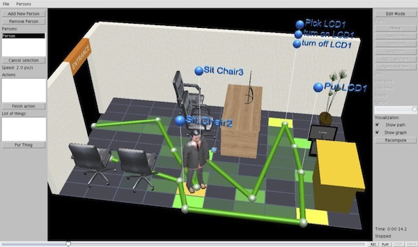
In case, when the environment model is represented in a form of 3D model, 3D visualization of the user behavior can be used – see figure bellow. The visualization allows to visualize user movement in the environment. The user behavior log may be recorded from real sensors or it may be created manually as a transformation from video recordings into simulated user scenario.
The output of the visualization of the user behavior is represented by the avatar, by the path and by the interaction spots represented by blue balls with interaction description. Such a visualization is performed in virtual environment where usability practitioner can manipulate both with the virtual environment (zooming, rotations with camera) and with the data sets visualized (user posture log and user behavior log). Thanks to that the usability practitioner can get much better idea about user's intentions, habits, behavioral patterns, etc.
An interesting option in the 3D visualization is the investigation of test participant movement strategy that has been chosen by the test participant. This information can give important information about the user background on which the selection of the movement strategy was based on. The visual analysis, see figure bellow, results in determination of spots in the environment in form of colored tile overlay where the test participant spent more time or where the user appeared frequently.
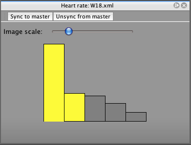
Heart Rate Variability (HRV)
In IVE tool, HRV visualization plug-in shows HRV data sets in a form of bar graph, see figure bellow. First bar represents value of ratio between low frequency heart rate and high frequency heart rate (LF/HF ratio) for first 4 minute (4 minute sliding window of FFT) of analyzed signal. Second bar represents value of LF/HF ratio for signal from time 1:00 min to 5:00 min. Each next bar means sliding the window by 1 minute. Exact LF/HF ratio value is shown in Detail window. The color of bar is yellow when the actual time of video playback in Video viewer plug-in intersects corresponding sliding window time interval. Therefore up to 4 bars can be indicated as “active” and highlighted in yellow. Stress level from HRV parameter is estimated from active bar values relatively to each other.